eepyikes
Old Members
-
Joined
-
Last visited
-
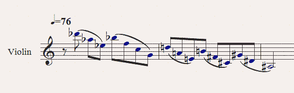
Well, now that you mention it! How about this upwards fifths section? I guess I'm also trying to imagine how the bowing would work.
-
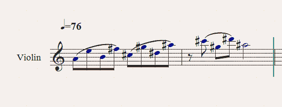
Ok I've attached an image of the aforementioned violin line. Easy? Medium? Awkward?
-
Hi, I'm wondering if I can get some pointers on string capabilities. Writing a piece for, say string quartet, is it difficult for them to play a melody which is comprised entirely of fifths? Let's say quarter=76 and the melody is mostly eighth notes with some half notes and rests in there. Basically I'm wondering if the strings can freely move around by fifths (and down by fourths). Even when doubled in unison?
-
Unfortunately at this point, practice isn't going to do much without further instruction. I've been writing like this for many years. It's not chicken scratch, but not as clean as I want either. @robinjessome, I've heard of the credit card thing and I did use that for a while but I found it too slow for me. Any tips on speed? Oh, I also found that even just using the card to draw barlines made a big difference.
-
I really love Judy Green's (now allprintusa.com ) P-538 paper, Double-Sided. It is 14"x17" landscape with perfectly spaced staves on manila colored heavy-stock paper. It is easy on the eyes and gives brilliantly ample room for sketching things out. You can buy it on a huge pad, double-sided. The great thing about the heavy-stock is that nothing shows through from the other side and it's sturdy. The staves are spaced in such a way that it works nicely for piano as well as any groupings of other instruments. But the main thing I'll reiterate is SPACE! Sometimes I notate the piece as it progresses on the front of the paper and on the back I'll test out individual ideas randomly all over the page, or group them if need be.
-
Hi, I searched the site for this topic but didn't find anything, so sorry if this is a repeat question. I wonder if anyone has any resources for improving handwritten notation. Not as a final product necessarily, but mostly for sketching. I tend to be able to read my notation well, but it is a little wiggly at times and occasionally other people have trouble reading it. I'm fairly good at rhythmic spacing and drawing the actual notes. But beams really bug me and I'd love to pick up some pointers on other aspects as well. Are there any good web resources/tips? I have Gardner Read's book, but I'm really looking for something about the actual process of drawing things, not the technical details.